
The way people use mobile devices has changed over the last decade. Mobile phone searches are consistently rising. If you have a website and it is not optimized for mobile then you are at a great loss. Here are a few tips on optimizing your website for mobile.
Why Optimize for Mobile?
Mobile phones are everywhere, they are a part of everything that we do. According to ComScore, “the concept of ‘mobile-first’ is no longer exclusive to technology-focused businesses and consumers, but is the default position for a growing number of internet users, who now consider smartphones and tablets essential to their daily lives.”
Average time spent on mobile devices is more compared to desktops. According to go-globe.hk “52.7% of global internet user access the internet via Mobile Devices.”
Mobile SEO is a crucial factor as Google is expected to roll out its Mobile-First Index update early next year. Through this update, the search engine giant is going to change indexing from desktop to mobile, so it is necessary for you to prepare your website for this update.
Difference Between Desktop and Mobile SEO
Viewing the desktop website on a mobile device can be a difficult experience for the user if it is not responsive or mobile-friendly; users are forced to pinch and zoom to read the content present on your website. Mobile SEO is slightly different than desktop SEO. You cannot apply traditional desktop SEO tactics for mobile. For mobile devices and smartphones, you have to optimize the website for smaller screens.
The website layout for the desktop will not work for mobile devices, for smaller screens, you must make sure it gives a better viewing experience. It should have easy navigation access to all pages. Also, you have to check the content is properly aligned and users are able to understand what are you trying to communicate through your website.
Choosing Mobile Configuration
Check whether your website is mobile-friendly or not by taking the Mobile-Friendly Test here.
There are three ways to make a website Mobile Friendly:
- Responsive web design
- Dynamic Serving
- Separate URLs
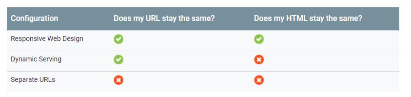
Google recommends using responsive web design because it is simple, easily accessible for users, and secure. Read more here about responsive web design.
Here are the SEO tips to optimize your Mobile website:
1. Mobile First Approach:
Mobile-first is an approach to responsive design: a design for smaller screens first, then add more features and content for bigger and bigger screens. (Source: Moboom.com)

- Easy Navigation
- Content should be easily accessible
- Use static social buttons
- Avoid using large graphics
2. Avoid too many Popups:
On August 2016 Google announced that starting from January 10, 2017 sites with intrusive interstitials will not be able to rank high on search results. Google rolled out this update because they want to improve the user experience so that content is easily accessible.
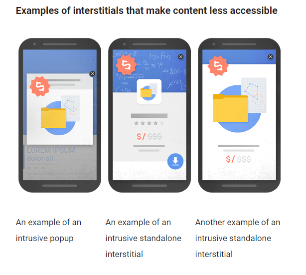
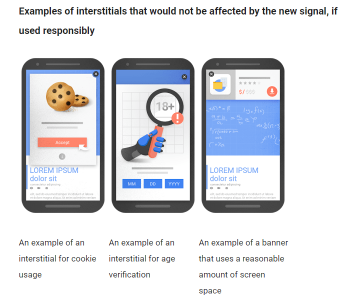
Google recommends using the following:
- Small HTML banners, images
- Browser supported app install banners such as chrome
- Android App indexing banners
3. Utilize White Space:
Make proper use of whitespace. Whitespace is necessary for good website designing. Consider these three factors while implementing whitespace:
- Text
- Images
- CTAs
Also, carefully choose a font style and font size for the better readable experience.
4. Optimize Content:
Optimize content for smaller screens. You need to make sure that whatever content you are adding on the mobile website it fits in smaller screens.
- Website headings and titles should be short and simple
- Split your content into small paragraphs
- Use sub-headings it will increase user engagement
- Style your content with bullet points, italics, etc.
- Add smartphones compatible videos
- Use high-quality images, but avoid using too many images
- Make email id & phone numbers clickable
- Optimize tap buttons
5. Page Speed:
Page speed is now a ranking factor for mobile sites. Take the page speed test and fix the website speed issues. PageSpeed Insights Rules by Google
Speed Rules
- Avoid landing page redirects
- Enable compression
- Improve server response time
- Leverage browser caching
- Minify resources
- Optimize images
- Optimize CSS Delivery
- Prioritize visible content
- Remove render-blocking JavaScript
- Use asynchronous scripts
Usability Rules
- Avoid plugins
- Configure the viewport
- Size content to viewport
- Size tap targets appropriately
- Use legible font sizes
6. Implementing AMP:
AMP, Accelerated Mobile Pages, an open-source project lead by Google. AMP allows the website to load faster on mobile devices. Read more here about AMP here.
- Implementing AMP can reduce bounce rate
- It can help in increasing the conversion rate
- Improves website visibility
7. Optimize for Local Search:
If you have a local business then your website must be optimized for local searches. Most of the local searches happen through mobile devices. Optimize website content, make sure you have consistent Name, Phone no. & Address every. Additionally, you could create a Google business page.
8. Prepare for Voice Search:
“The number of voice searches on mobile has more than doubled in the past year.” – Gary Illyes (Google)
- Optimize website content for voice search queries
- Use long-tail keywords
- Include questions in your website content
9. Structure Data:
Structure data helps crawlers understand your webpage content. Adding it will enhance how your websites will appear in search results. A search engine allows you to display the following information in search results.
- Business details – the physical location and contact information
- Marketing details – your official name, logo, and social profile info
10. Optimize Meta tags for Mobile:
Check whether your title tags and meta descriptions tags are optimized for mobile to display in the search results. Google has increased the title tag length for mobile can add up to 75 characters.
11. Keywords for Mobile:
Choose your keywords for mobile wisely. Keywords for mobile should be short (2-3 words). Most of the searches for mobile devices are location-based. So, include location-based keywords in your content.
12. Avoid Flash & Java:
Most smartphones do not support flash and java plugins. Having these might cause user’s smartphones to hang and/or browsers to crash.
Consider these tips to optimize your website and do let us know your thoughts in the comment section.