Table of Contents
- The 7 Metrics Your Board Actually Cares About
- Pipeline Velocity: The One-Number Health Check
- CAC Payback Period: The Efficiency Metric Boards Trust
- Net Revenue Retention: The Compounding Engine
- Building the CEO Dashboard in HubSpot
- Case Study: Instrumented Demand at Fortune 500 Scale
- When a RevOps Dashboard Is Premature
- Where to Start
- Frequently Asked Questions
Need help with B2B Marketing?
Let the smarketers’ team drive your pipeline with data-led campaigns and AI-powered growth strategies.
A CEO asks a simple question in the Monday leadership meeting: are we going to hit the number this quarter? Marketing answers with MQLs, up and to the right. Sales answers with pipeline coverage, comfortably above 3X. Customer success answers with a health score nobody can define. Three dashboards, three shades of green, and the quarter still misses. Every one of those teams told the truth. None of them answered the question.
This is the reporting problem Revenue Operations exists to fix, and the evidence says fixing it pays. Companies with RevOps see 36% more revenue growth and up to 28% higher profitability, and public companies with dedicated RevOps functions showed 71% higher stock performance. The function has gone mainstream accordingly: roughly half of companies now run dedicated RevOps, up from a third in 2020, and Gartner projected that 75% of the highest-growth companies would adopt the model by 2025.
But RevOps only delivers those outcomes when it changes what the CEO looks at. This article lays out the seven metrics that belong on that one page, the formulas behind the three most misunderstood ones, and how to build the dashboard in HubSpot so it updates itself instead of consuming an analyst every month-end.

The 7 Metrics Your Board Actually Cares About
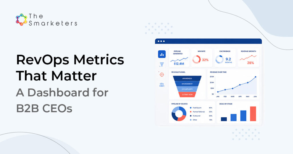
What RevOps metrics should a CEO track? Seven, and only seven: pipeline velocity, CAC payback period, net revenue retention, win rate by segment, MQL-to-SQL conversion, pipeline coverage, and forecast accuracy. Together they answer the four questions every board meeting circles: are we growing efficiently, is the growth durable, where is it coming from, and can we trust the forecast. We call this one-page layout the CEO Revenue Dashboard.

The discipline is in what stays off the page. Traffic, impressions, activity counts, and raw MQL volume are operating metrics; they belong in team dashboards, not in front of the CEO. A useful test for any candidate metric: if it moved 20% next month, would you change a decision? If not, it is reporting theater.
Key takeaway: A CEO dashboard is not a smaller version of every team’s dashboard. It is a different instrument: seven numbers, consistent definitions, reviewed on the same day each month, with one owner accountable for data integrity.
Each metric earns its slot by answering a board question and carrying a decision trigger:
| Metric | Board question it answers | Decision trigger |
|---|---|---|
| Pipeline velocity | Is the revenue engine speeding up or slowing down? | Two consecutive down months: diagnose which variable moved |
| CAC payback period | Are we buying growth at a price we can afford? | Payback lengthens two quarters running: revisit channel mix |
| Net revenue retention | Would we grow if we signed no new logos? | NRR below 100%: shift investment toward the installed base |
| Win rate by segment | Where do we actually win? | One segment 2X another: reweight targeting and territory plans |
| MQL-to-SQL conversion | Does marketing volume become sales opportunity? | Conversion falls while volume rises: fix definitions, not ads |
| Pipeline coverage | Is next quarter already at risk? | Coverage under target with aging deals: trigger generation plays now |
| Forecast accuracy | Can we trust what we are being told? | Accuracy drifting: audit stage discipline before blaming the market |
Pipeline Velocity: The One-Number Health Check
Pipeline velocity tells you how much revenue your pipeline produces per unit of time, and it is the single best summary of revenue-engine health because every lever appears in the formula:
Pipeline velocity = (qualified opportunities × win rate × average deal size) ÷ sales cycle length in days
The power of the metric is diagnostic. Revenue can stall while opportunity count rises, and velocity tells you why: win rate slipping in one segment, deal sizes shrinking under discounting, or cycles stretching as more stakeholders enter the deal. Each variable is owned by a different team, which is exactly why the number belongs to RevOps and the CEO rather than to any one function. Run your own numbers in our pipeline velocity calculator to see which variable is your binding constraint.
Watch velocity by segment, not just in aggregate. A healthy blended number routinely hides one segment where cycle length has quietly doubled.
CAC Payback Period: The Efficiency Metric Boards Trust
CAC payback period is the number of months of gross margin it takes to recover the cost of acquiring a customer:
CAC payback (months) = customer acquisition cost ÷ (monthly recurring revenue per customer × gross margin %)
It beats raw CAC as a board metric because it prices efficiency in time, and time is what cash planning runs on. The inputs deserve honesty: acquisition cost should carry fully loaded sales and marketing spend, not just media. For context on the cost side, blended B2B cost per lead runs around $198, with SaaS paid channels near $310, and the average B2B cost per sales qualified lead reached $1,357 in FY2024. Numbers like those compound quickly into payback months when conversion leaks. Our customer acquisition cost calculator handles the fully loaded version.
What counts as good depends on your motion and contract length, so benchmark against your own trend first: payback lengthening two quarters in a row is a decision trigger regardless of where you sit against industry norms.
Net Revenue Retention: The Compounding Engine
Net revenue retention measures how revenue from existing customers changes over a period, expansion minus churn and contraction:
NRR = (starting ARR + expansion − churn − contraction) ÷ starting ARR × 100
Above 100%, the installed base grows without a single new logo; below it, new business starts every quarter in a hole. For the CEO dashboard, NRR earns its slot because it replaces every other metric: strong retention justifies longer CAC payback and more aggressive pipeline investment, while weak retention makes even efficient acquisition a leaky bucket. Pair the headline number with its two drivers, gross churn and expansion rate, so the dashboard shows whether NRR is rising because customers grow or merely because churn is masked by one large expansion.
Two practical notes on NRR for the dashboard. First, measure it by cohort as well as in aggregate: a strong blended NRR can conceal a weak recent cohort, and the recent cohorts are the forecast. Second, agree to the treatment of one-time services revenue up front, because including it flatters the number and the flattery gets discovered at diligence, which is the worst possible time.
The remaining four metrics need less formula work but equal discipline:
- Win rate by segment. The blended win rate is a vanity number; the segment-level view is a strategy document. Most companies discover they win twice as often in one vertical or deal band as anywhere else, and that finding should redirect territory design, content investment, and hiring before any other metric moves.
- MQL-to-SQL conversion. The handoff leak that quietly inflates every downstream cost. For context on how thin B2B funnels run, the median B2B conversion rate is 2.9% per Ruler Analytics’ 100M+ data points, which makes every percentage point lost at the handoff expensive. Our MQL-to-SQL conversion calculator benchmarks the leak against your own history.
- Pipeline coverage by stage age. Raw coverage rewards hoarding: 3X coverage built on deals that have not moved in ninety days is not coverage, it is inventory shrinkage waiting to be recognized. Report coverage with an age filter and the number becomes honest.
- Forecast accuracy. Committed forecast versus actual, trailing four quarters. This is the trust metric: when it is tight, the board extends the benefit of the doubt everywhere else on the page; when it drifts, every other number gets relitigated in the meeting.
Building the CEO Dashboard in HubSpot
HubSpot can run this entire dashboard natively if, and only if, the underlying definitions exist first. The build order we use:
Step 1.Define the dictionary. Written definitions for MQL, SQL, opportunity, and each lifecycle stage, signed by sales and marketing leadership. Every dashboard failure we have audited traces back to this step being skipped.
Step 2. Enforce stage hygiene. Required fields on stage transitions (amount, close date, next step), automated stage-age tracking, and a weekly exception list for deals violating the rules.
Step 3.Build calculated properties. Deal-level cycle length, weighted amounts, and cohort tags. These power velocity and payback math without spreadsheet exports.
Step 4. Assemble the one page. Seven reports, one dashboard, shared to the leadership team with a fixed monthly review date. Team-level dashboards link from it; nothing else lives on it.
Step 5. Automate the narrative. Each metric gets a target band and an owner. The monthly review discusses only metrics outside their band, which keeps the meeting at thirty minutes.
One structural reason to run this in the CRM rather than a BI layer bolted on later: the self-serve shift. Gartner finds 67% of B2B buyers prefer a rep-free buying experience, which means more of the journey happens in systems marketing and web teams control. If that activity is not captured in the same platform that holds deals, your velocity and conversion numbers describe a shrinking fraction of reality.
Expect the first month of output to look worse than the reporting it replaced. Consistent definitions surface the deals that were being counted twice, the pipeline that was aging quietly, and the conversion steps nobody owned. That dip is not the dashboard failing; it is the previous reporting confessing.
On ownership: the dashboard needs exactly one accountable owner for data integrity, typically the RevOps or operations lead, with the CEO owning the review itself. Rollout works best in two passes: run the dashboard privately for one month to catch definitional surprises, then make it the official record. Announcing it as authoritative on day one, before the numbers have been stress-tested, is how dashboards lose the room.
Case Study: Instrumented Demand at Fortune 500 Scale
A Fortune 500 industrial automation company engaged us with a familiar architecture problem: real demand, disconnected measurement, and leadership reporting stitched together from exports. We rebuilt the motion on the principles above, tight lifecycle definitions, stage hygiene, and a single reporting spine, then ran targeted ABM against named manufacturing accounts through it.
Result: The program produced 300+ sales opportunities in 4 weeks with cost per lead cut by 90%, and every one of those opportunities was visible, staged, and attributable in the same system leadership reviewed. (Smarketers client engagement; full story at thesmarketers.com/success-stories/)

The measurement discipline was not incidental to the result; it was the mechanism. Because definitions were fixed before the campaign, the team reallocated spend twice in four weeks based on segment-level velocity, which is where most of the 90% CPL reduction came from.
When a RevOps Dashboard Is Premature
An honest boundary: not every company should build this next quarter.
- If your CRM data hygiene is poor, fix that first. A dashboard on top of inconsistent stages and missing amounts does not create clarity; it laminates confusion. Budget one to two quarters of definitional and hygiene work before trusting any of the seven numbers.
- If you have fewer than a few dozen closed deals, several of these metrics are statistically noise. Early-stage companies should track velocity inputs directionally and resist quarterly conclusions from a dozen data points.
- If the leadership team will not commit to shared definitions, RevOps tooling cannot arbitrate a political problem. The dictionary conversation is uncomfortable precisely because it forces teams to give up flattering private metrics; skipping it guarantees the dashboard dies within two quarters.
Where to Start
Start with a paper exercise, not a tool: write the seven metrics on one page and try to fill in the current values. Most leadership teams can complete three or four. The blanks are your RevOps roadmap, in priority order.
If you want that gap assessed properly, book a RevOps Assessment. We audit your definitions, data hygiene, and reporting spine, and hand you a build order for the dashboard, whether or not we build it with you.
Frequently Asked Questions
How long does it take to stand up a CEO revenue dashboard?
With clean CRM data, two to four weeks in HubSpot. With typical data, one to two quarters, because the real work is definitions and hygiene rather than report building. Rushing the dashboard before the dictionary produces confident-looking numbers nobody should trust.
Do we need a dedicated RevOps hire before building this?
No. A fractional owner or a disciplined operations lead can run the build; what is non-negotiable is a single named owner for definitions and data integrity. Roughly half of companies now have dedicated RevOps, but the dashboard practice matters more than the org chart.
What cadence should the CEO review these metrics?
Monthly for the full seven, with pipeline coverage and forecast accuracy glanced at weekly in-quarter. More frequent full reviews amplify noise; less frequent ones turn the dashboard into wallpaper.
Which of the seven metrics should we fix first if resources are tight?
Pipeline velocity, because computing it forces the definitional work (stages, win rate, cycle length) that every other metric reuses. CAC payback comes second since it anchors budget conversations with the board.
What tools beyond HubSpot do we need?
For most companies under a few hundred employees, none: CRM-native reporting plus disciplined properties covers all seven metrics. Add a BI layer only when you need multi-system joins, for example product usage data feeding NRR analysis.
How do we set target bands for each metric?
Use your own trailing four quarters as the baseline and set bands around trend, then layer external benchmarks as context rather than targets. External medians, like the 2.9% B2B conversion figure, are useful for calibration but your motion, deal size, and cycle length make your own trend the honest yardstick.
Is win rate or pipeline coverage the better forecast signal?
Neither alone. Coverage without stage-age discipline rewards hoarding stale deals, and win rate lags by a full cycle. Forecast accuracy, tracked as committed vs actual over trailing quarters, is the metric that tells you whether the other two are being gamed.
What does a RevOps engagement with an agency typically cover?
Audit of definitions and data hygiene, lifecycle and stage redesign, calculated properties and dashboard build, and a review cadence with metric owners. Expect meaningful board-ready reporting after one quarter and trustworthy trend lines after two, since several metrics need history to mean anything.

Indrani Gope
Content Head